Apie projektą:
Šalis: Lietuva
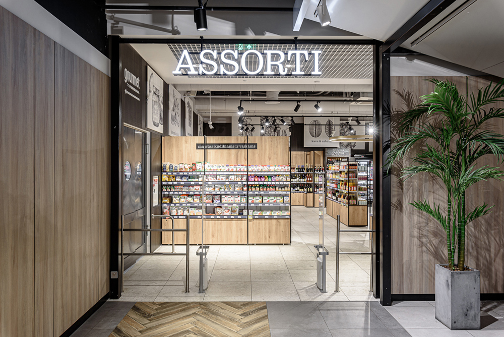
ASSORTI parduotuvė
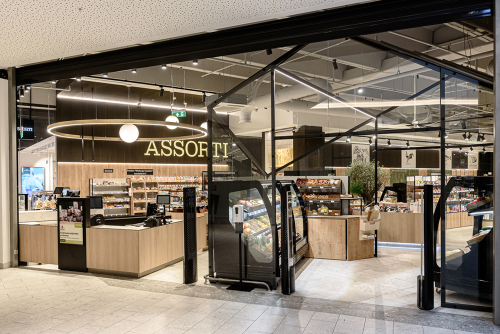
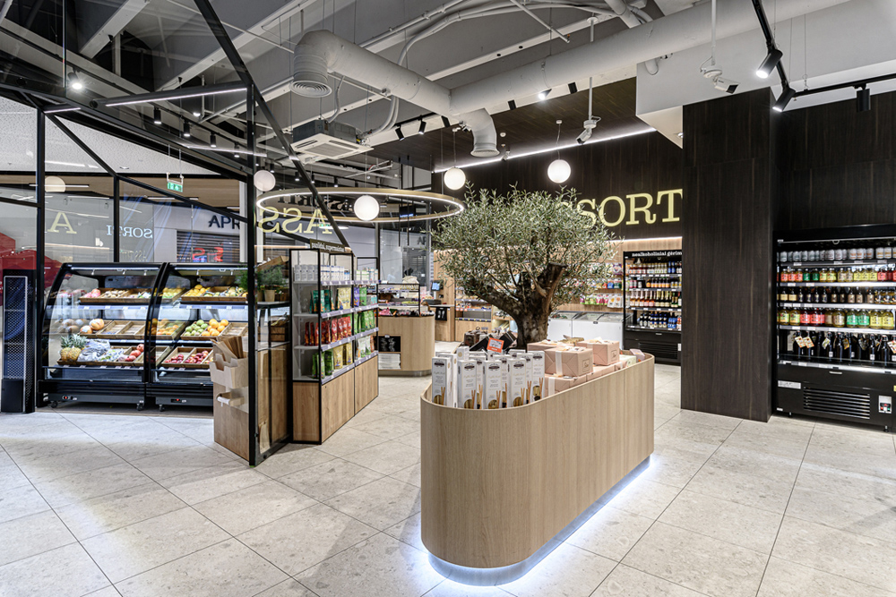
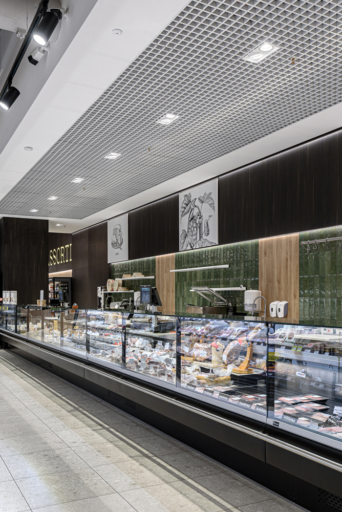
Pagrindinė interjero idėja yra spalvinis nuosaikumas bei funkcionalumas erdvėje su itin kokybiška ir kiek įmanoma natūralia aplinka. Dauguma mūsų grįžtam prie kuo sveikesnių, natūralesnių bei išieškotų skonių, tad tai ir stengiamasi atskleisti bei paryškinti kuriant šį ASSORTI parduotuvės interjerą. Viena prekybos salės pusė yra dengta tarsi tamsaus šokolado ar skrudintos kavos spalvos baldine plokšte, kuri kontrastuoja su šviesaus ąžuolo tekstūros baldais bei detalėm. Visa tai simbolizuoja ir gastronomijos pasaulio įvairovę ar galimybes: saldu, sūru, kartu, aštru ar subtiliai pikantiška su visa prieskonių aura. Paliekant atidengtas betonines lubų konstrukcijas mes kartu ir sukuriam didesnės erdvės pojūtį su monumentaliu konstruktyvo vaizdu. Iš visų pusių matomas akcentinių ar proginių prekių ekspozicinis stalas yra išryškintas gyvu ir natūraliai žaliuojančiu bei augančiu lauru, alyvmedžiu.
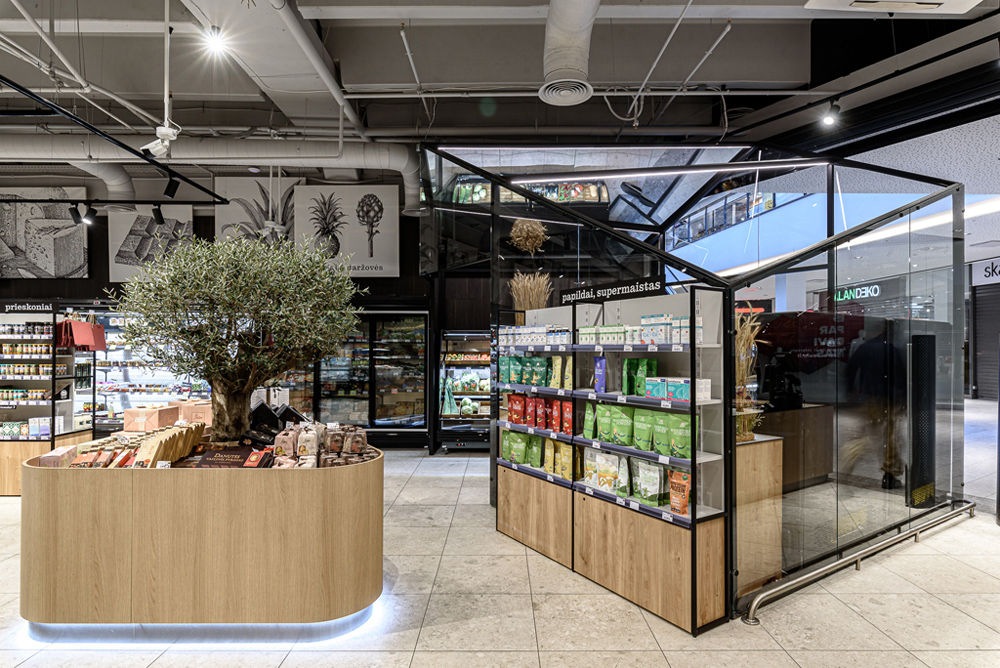
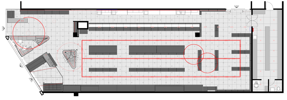
Ta pati kaip ir Panoramos prekybos centre naudojamos akmens masės plytelių, tik kito – monumentalesnio matmens 600 x 600 mm grindų danga sukuria tęstinumo įspūdį bei lengvą judėjimą simbolizuojančią trauką. Įėjimas formuojamas per šviežių vaisių bei daržovių stiklo namus su specialia klimato kontrole bei galimybe papildomai drėkinti orą. Dalis „namelio“ lubų yra dengiama sendinto veidrodžio plokšte, kas duos ne tik papildomos erdvės pojūtį, bet ir papildomai parodys visą vaisių bei daržovių asortimentą.
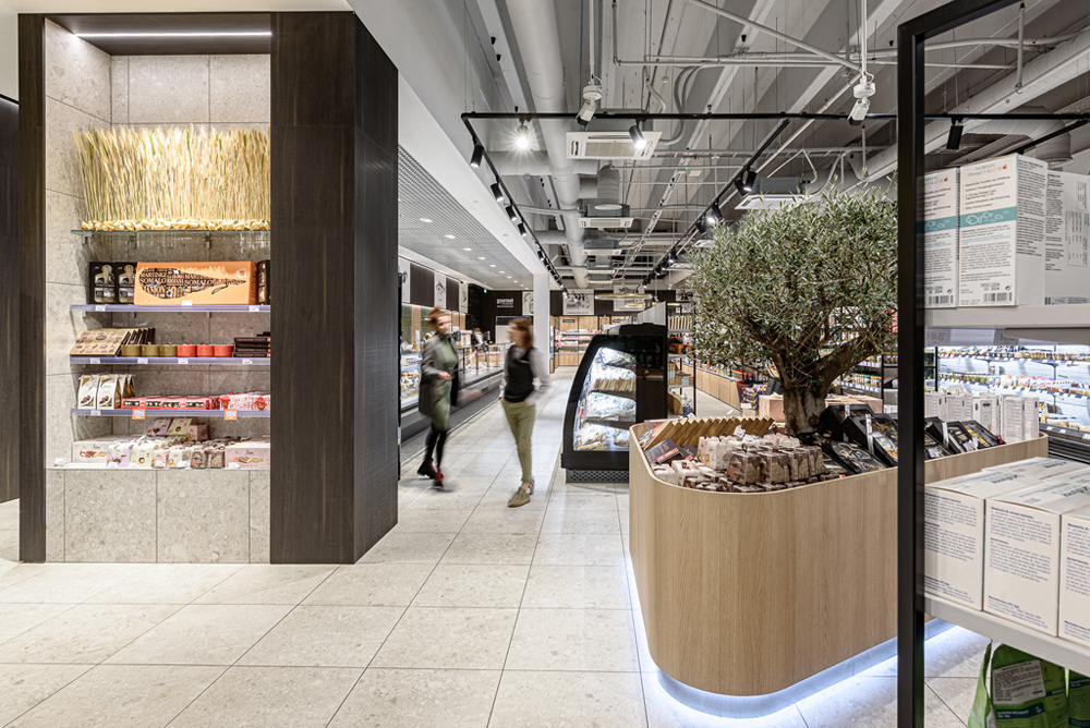
Parodant kokybiško produkto ilgaamžišką vertę interjere yra naudojami monochrominiai klasikinės stilistikos grafikos printai ant drobės, kurie pagal pageidavimą ar kintančius komercinius poreikius gali būti lengvai transformuojami į papildomus informacinius plotus.
Interjere naudojamos spalvos yra lengvai derinamos ir turi skonio atitikmenis – tamsus šokoladas ar kava, šviesi ąžuolo baldinė plokštė – tai duona, bandelė ar sūris ir sodri avokado ar alyvmedžio žalia spalva, tai kulinarinės zonos keramikos spalva. Matomos sienos dalys ir paliekamos betono lubos bus dengiamos šviesia fonine pilka spalva, o dalis nuleistų iš gipso kartono suformuotų lubų dažomos baltai, kad suteiktų malonų kontrastą tamsiai su įmontuotu LED pašvietimu baldinės plokštės sienai.
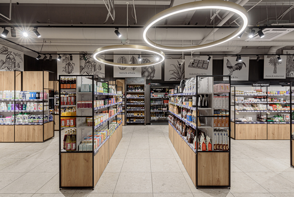
Prekybos salės apšvietimas yra daugiasluoksnis ir daugiaplanis. Pagrindinis šviesos srautas yra teikiamas bėginėj sistemoj pakabintais prožektoriais, tikslingai nukreiptais į prekes, praėjimus bei akcentines ekspozicijas. Reikšmingas šviesos srautas bus iš visų LED juostų įmontuotų vaisių bei daržovių namo metalo konstrukcijose, kulinarinės zonos sieniniam keramikinių plytelių pašvietime bei lentynose. Dekoratyvūs bei skirtingų matmenų balti šviestuvai – burbulai suteikia jaukaus naminio žavesio, o akcentiniai lankai su įmontuotomis LED juostom paryškina parduotuvės tūrį.
English
The main idea of the interior is colour moderation and functionality in a space with a high quality and as natural an environment as possible. Most of us go back to healthier, more natural and sought-after tastes, and this is what we have tried to show and emphasise in the design of this ASSORTI store interior. One side of the sales floor is covered with a dark chocolate or roasted coffee-coloured furniture panel, which contrasts with the light oak-textured furniture and fittings. All of this is also symbolic of the diversity or possibilities of the gastronomic world: sweet, salty, combined, spicy or subtly savoury with a whole aura of spice. By leaving the concrete ceiling structure exposed, we also create a sense of a larger space with a monumental view of the structure. The display table for accent or commemorative products, visible from all sides, is highlighted by a lively and naturally green and growing laurel and lilac tree.
The same tile used in the Panorama Shopping Centre, but with a different, more monumental dimension of 600x600 mm, creates an impression of continuity and an attraction that symbolises easy movement. The entrance is formed through a glass house of fresh fruit and vegetables with special climate control and the possibility of additional humidification. Part of the ceiling of the 'house' is covered with an aged mirror panel, which will not only give a feeling of extra space but also additionally display the entire range of fruit and vegetables.
To demonstrate the lasting value of a quality product, the interior uses monochrome prints on canvas in a classical style, which can easily be transformed into additional information areas on request or to meet changing commercial needs.
The colours used in the interior are easy to match and have taste equivalents – dark chocolate or coffee, light oak panelling for bread, bread rolls or cheese, and rich avocado or olive green for the ceramics in the culinary area. The visible parts of the wall and the exposed concrete ceiling will be covered with a light background grey, while part of the lowered plasterboard ceiling will be painted white to provide a pleasant contrast to the dark wall of the furniture panel with built-in LED lighting.
Nuotraukos: Benas Šileika
© 2025 visos teisės saugomos
Norėdami išsaugoti, prisijunkite.
Siekdami užtikrinti geriausią Jūsų naršymo patirtį, šiame portale naudojame slapukus.
Daugiau informacijos ir pasirinkimo galimybių rasite paspaudus mygtuką „Nustatymai“.
Jei ateityje norėsite pakeisti šį leidimą, tą galėsite bet kada galėsite padaryti paspaudžiant portalo apačioje esančią „Slapukų nustatymai“ nuorodą.
Tai portalo veikimui būtini slapukai, kurie yra įjungti visada. Šių slapukų naudojimą galima išjungti tik pakeitus naršyklės nuostatas.
| Pavadinimas | Aprašymas | Galiojimo laikas |
|---|---|---|
| storage_consent | Šiame slapuke išsaugoma informacija, kurias šiuose nustatymuose matomų slapukų grupes leidžiate naudoti. | 365 dienos |
| PHPSESSID | Sesijos identifikacinis numeris, reikalingas bazinių portalo funkcijų (pavyzdžiui, galimybei prisijungti, užildyti užklausos formą ir kitų) veikimo užtrikinimui. | Iki naršyklės uždarymo |
| REMEMBERME | Prisijungimui prie asmeninės paskyros portale naudojamas slapukas. | 1 mėnuo |
| OAID | Portalo vidinės reklaminių skydelių valdymo sistemos slapukas. | 1 metai |
| __eoi | Saugumo paskirtį atliekantis Google paslaugose (Google AdSense, AdSense for Search, Display & Video 360, Google Ad Manager, Google Ads) naudojamas slapukas. | 6 mėnesiai |
| sender_popup_shown_* | Naujienlaiškio užsakymo formos nustatymai. | 1 mėnuo |
Slapukai skirti informacijos apie portalo lankomumą rinkimui.
| Pavadinimas | Aprašymas | Galiojimo laikas |
|---|---|---|
| _ga | Google Analytics statistikos slapukas | 2 metai |
| _ga_* | Google Analytics statistikos slapukas | 2 metai |
Rinkodaros arba reklamos slapukai, kurie naudojami siekiant parodyti pasiūlymus ar kitą informaciją, kuri galėtų Jus sudominti.
| Pavadinimas | Aprašymas | Galiojimo laikas |
|---|---|---|
| test_cookie | Naudojamas Google paslaugose (Google AdSense, AdSense for Search, Display & Video 360, Google Ad Manager, Google Ads). | 15 minučių |
| __Secure-3PAPISID | Naudojama Google paslaugose vartotojo nustatymų ir informacijos saugojimui. | 13 mėnesių |
| __Secure-3PSID | Naudojama Google paslaugose vartotojo nustatymų ir informacijos saugojimui. | 13 mėnesių |
| _fbp | Facebook platformos slapukas. | 90 dienų |
| _fbc | Facebook platformos slapukas. | 90 dienų |
| datr | Facebook platformos slapukas. | 1 metai |