

Apie projektą:
Šalis: Lietuva
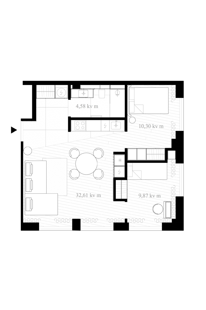
Plotas: 57,36 m2
Butas „Atgal į Senamiestį. Renesanso“
Buto interjeras kurtas dviejų asmenų šeimai. Interjero idėja – istorizmas, pratęsiant Renesanso komplekso (https://renesanso.lt) vizualinę mintį, panaudojant labai aiškiai eksterjere ir bendrosiose pastatų zonose juntamą ritmiką, reljefiškumą, faktūriškumą, spalvinę gamą.
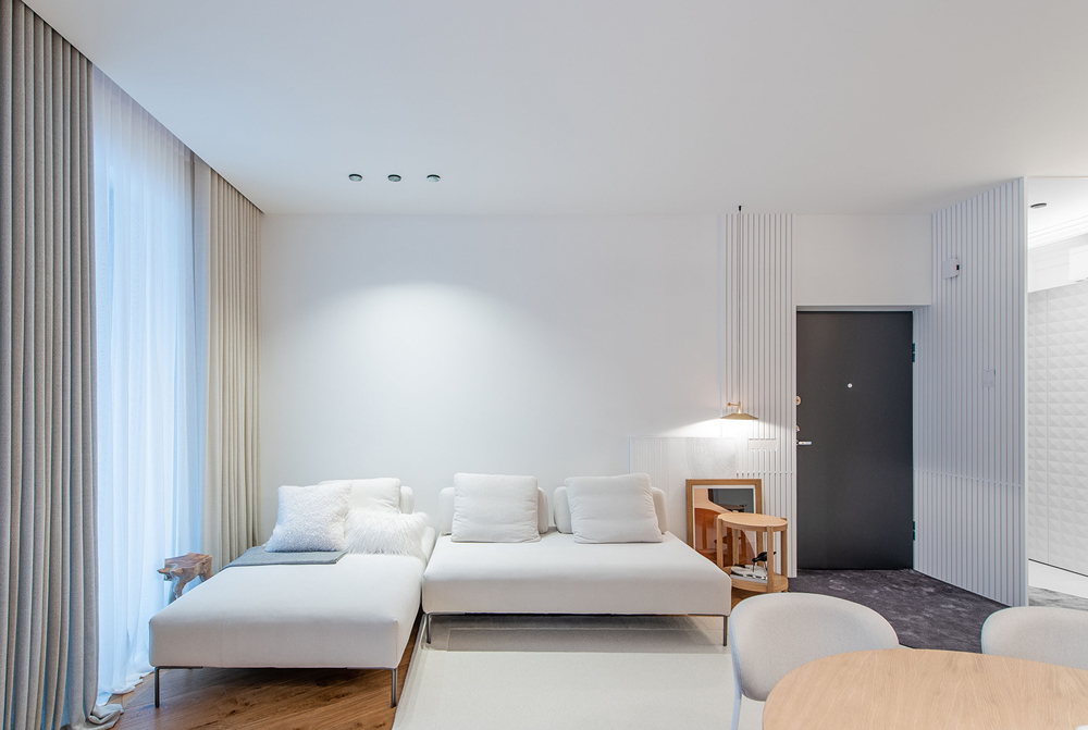
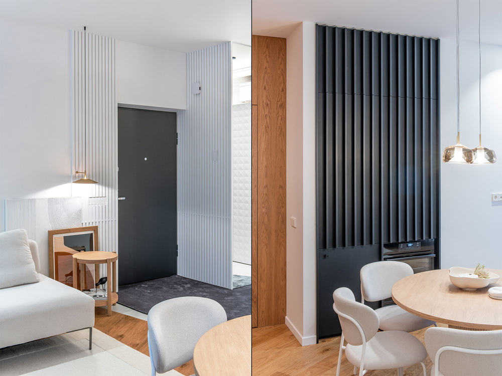
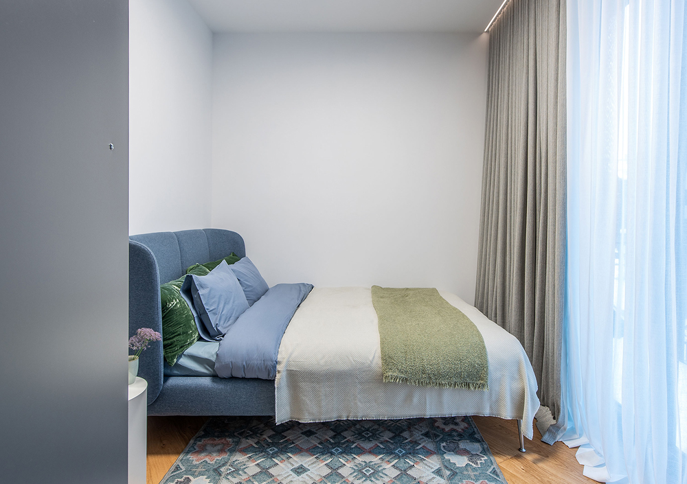
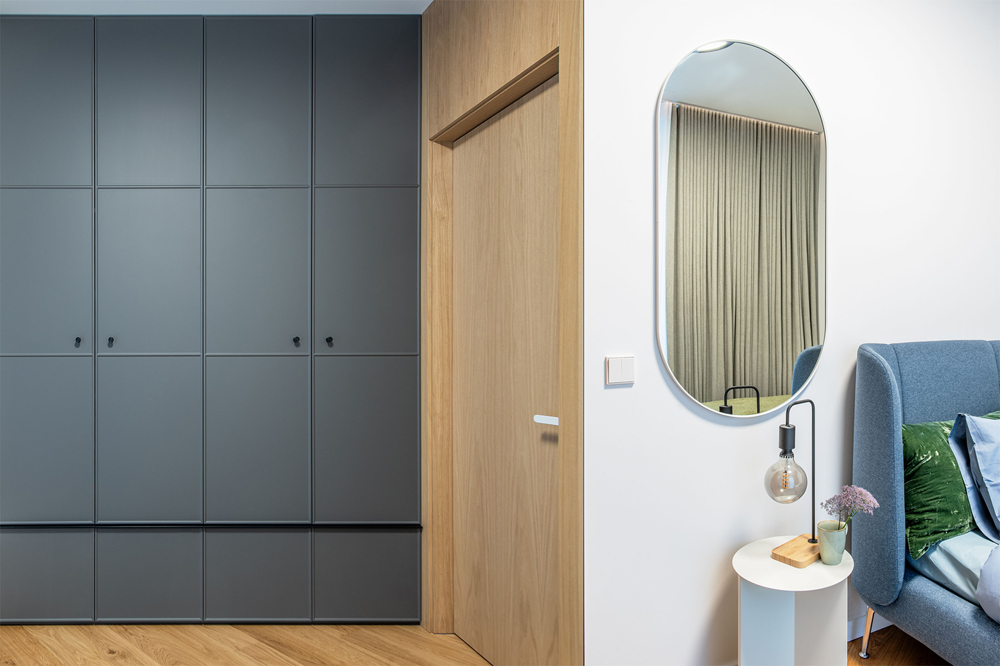
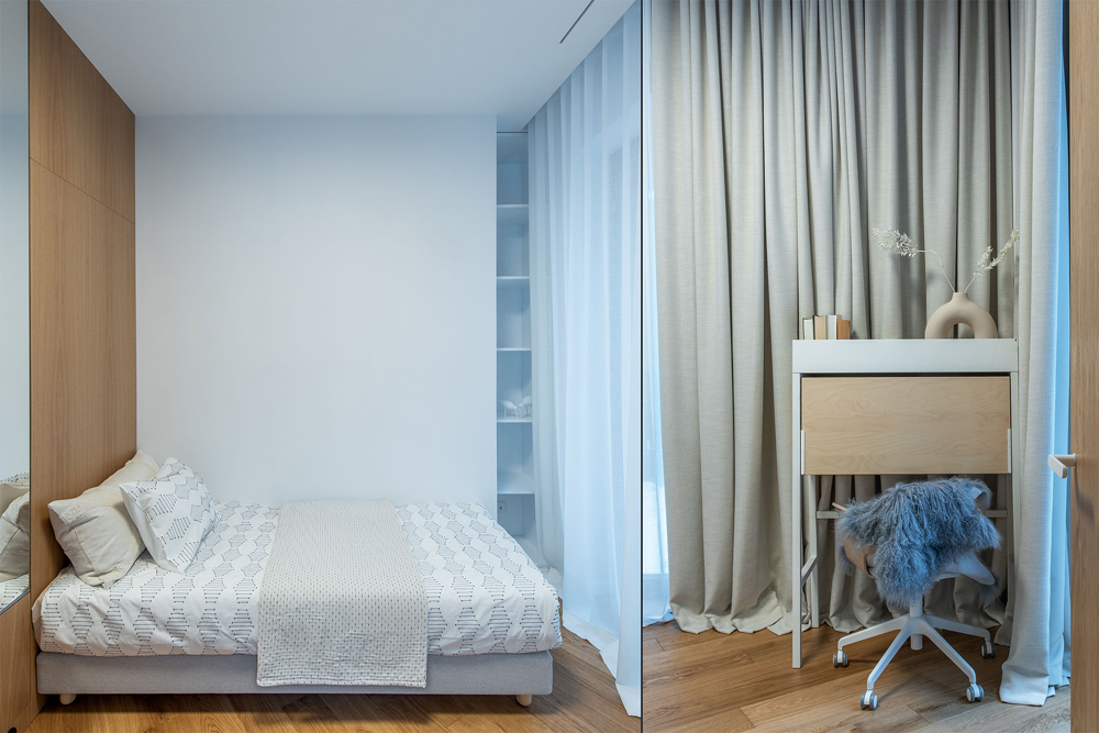
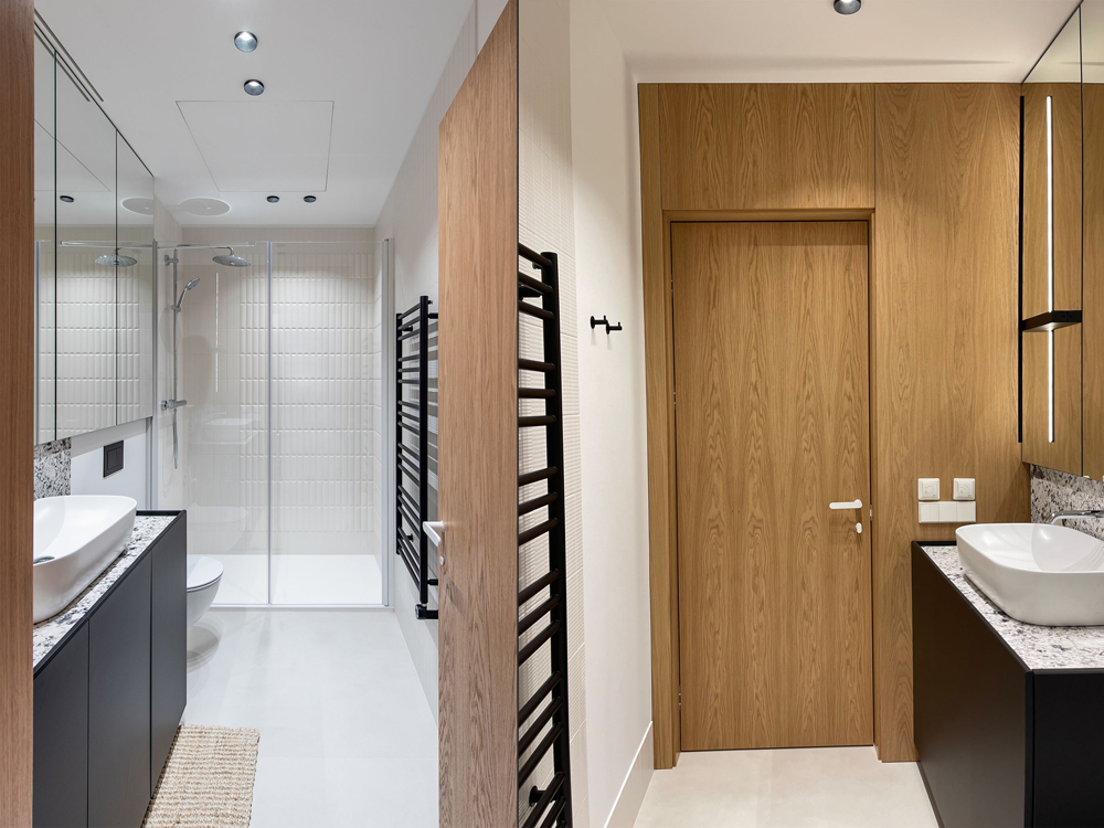
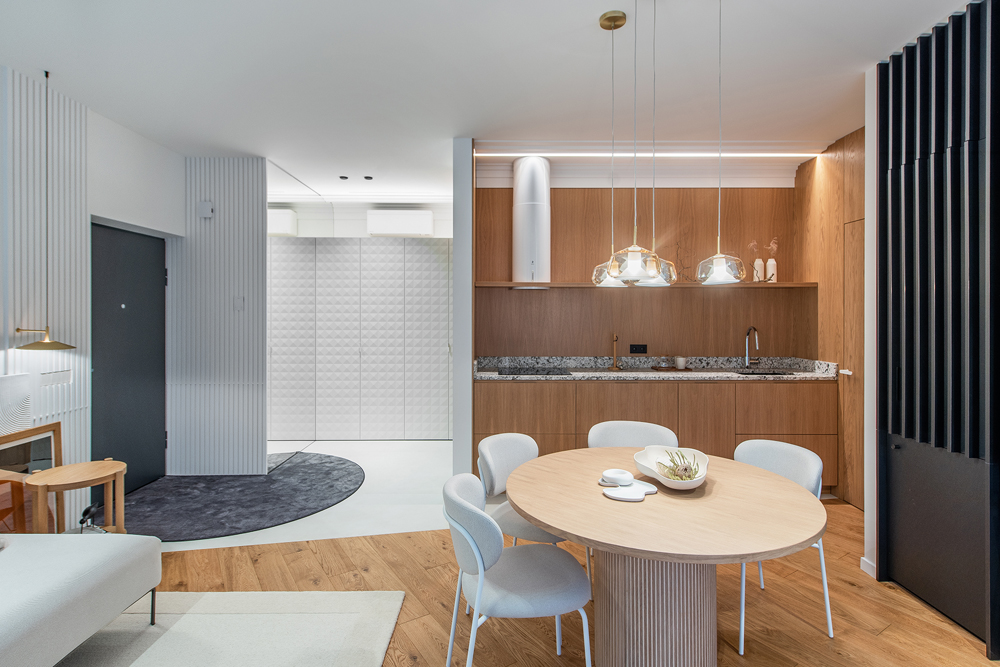
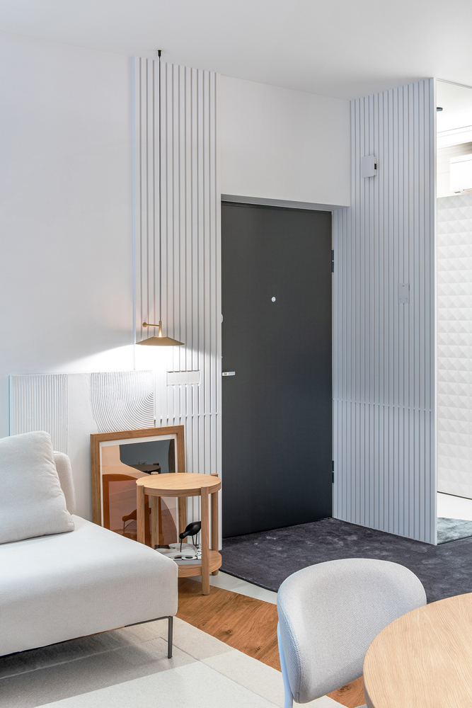
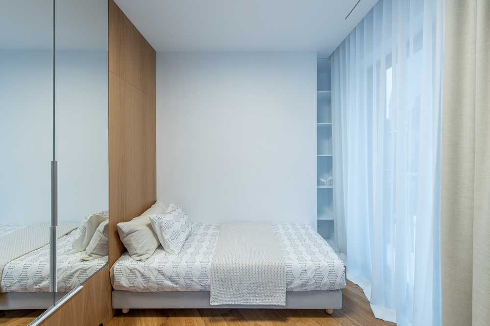
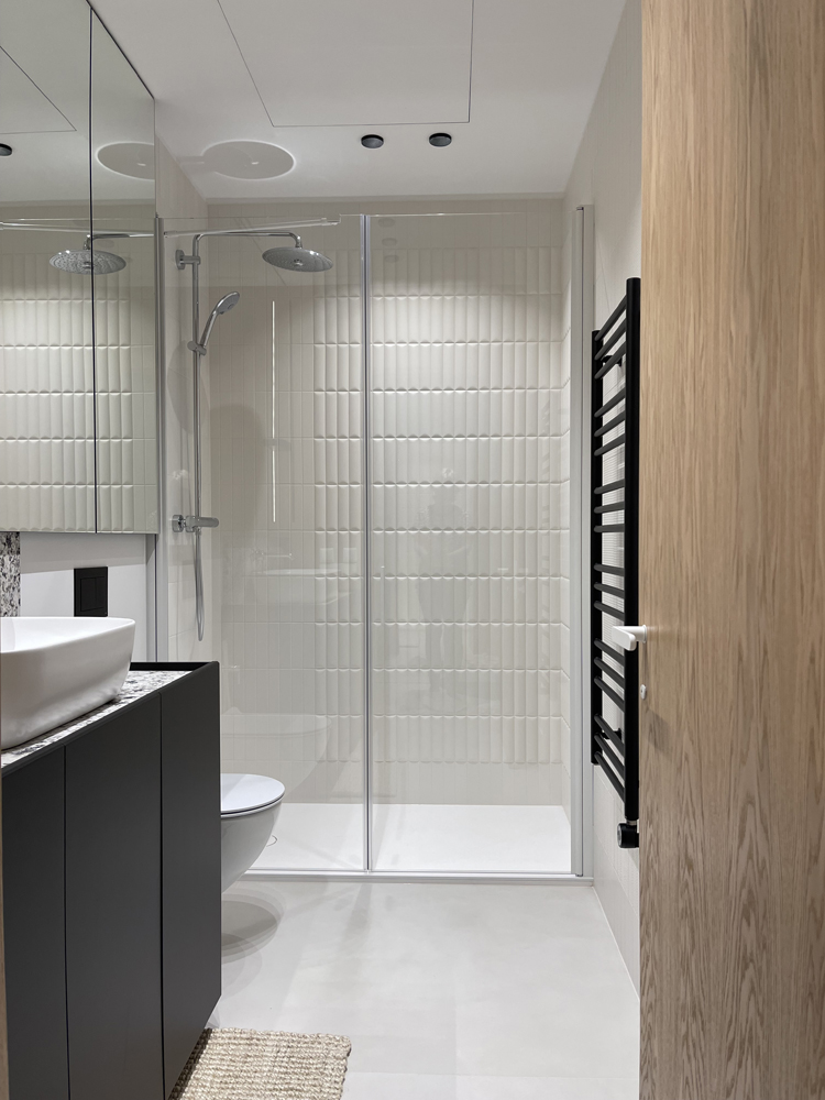
Komplekso statinių elementų geometrija atkartojama buto įėjimo zonos sienų apdailoje, spintos frezuotose durelėse ir virtuvės baldų juodų fasadų ritmikoje. Pastatų įstrižas orientavimas vidiniame kieme ir stačių šlaitinių stogų įstrižainės pratęsiamos ąžuolo parketlenčių orientavime ir skirtingų grindų dangų jungimo linijoje. Vidiniame kieme išsaugoti čia buvusių statinių sienų fragmentai, tad, kaip aliuzija į istorizmą, buto interjere panaudoti lipdinių intarpai virtuvės ir holo zonose bei frezuoti klasikinės stilistikos miegamojo korpusinių baldų fasadai, taip pat ir miegamojo lovos forma, medžiagiškumas bei kompozicija su austinio kilimo ornamentika, spalvomis ir faktūra. Į Vilniaus Sodų gatvę orientuoto pagrindinio Renesanso komplekso pastato išraiškinga sendintų raudonų plytų apdaila inspiravo buto vonios sienų plytelių pasirinkimą. Šių plytelių skirtingų reljefų deriniai sudaro individualų piešinį, primenantį austinio kilimo raštus, “užklojančius” tris vonios patalpos sienas.
Sendintų fasado plytų bei laiptinėse grindų dangai naudoto raudono klinkerio spalva atkartojama interjere renkantis natūralią ąžuolo spalvą grindims ir korpusiniams baldams bei sienų skydams. Juoda ir antracito spalvos – buto šviestuvuose, baldų fasaduose, renkenėlėse, holo kilime. Kaip atsvara tamsiems tonams interjere išlaikyta daug baltos. Su ja derinant kreminius atspalvius, sudaromi niuanso kontrastai, minkštinantys spalvinę paletę ir kuriantys jos įvairovę. Stalviršiams naudojamas natūralus akmuo apjungia interjere dominuojančias spalvas ir puošia interjerą smulkia ornamentika.
Buto planinė struktūra pritaikyta užsakovų poreikiams, racionaliam baldų išdėstymui funkcinėse zonose bei IKEA standartizuotų baldinių fasadų naudojimui.
Pagrindinio ir akcentinio dirbtinio apšvietimo sprendiniai užtikrina funkciją, leidžia reguliuoti jo intensyvumą bei papildo idėjinę interjero kompoziciją tiek apšvietimo objektų spalva, medžiagiškumu, forma, tiek krintančio šviesos srauto forma ir spalva.
English
The apartment interior was created for a two-person family. The choices behind the interior colour palette, finish and textiles continue and supplement the idea and the exterior of the “Renaissance project” (https://renesanso.lt).
The patterns of the hall walls, milled wardrobe and black kitchen cupboard facades continue the recurring motifs observable in the location of the Renaissance three-story buildings and their windows, sloping roofs and iron balcony barriers. Diagonal positioning of buildings in the inner courtyard, steep sloping roof diagonals were replicated in oak parquet positioning as well as in diagonal joining of the different flooring materials.
The complex was built on an old structure foundation, retaining the integrity of the old complex walls as a decorative element. For this reason, as a hint to historicism, ceiling mouldings were used in the entrance and kitchen areas as well as the classic patterns in the furniture facade of the bedroom wardrobe. The same intention applied selecting the bed’s form, fabric, and composition with the woven rug’s ornaments, colours, and texture.
The expressive rhythm of the aged red-brick main entrance to the complex is repeated by the bathroom wall tile patterns. Combination of wall tiles with different embossed patterns make up an individual picture, reminiscent of a woven rug pattern covering three bathroom walls.
The red colour of aged facade bricks and clinker in the landings was replicated in the interior with the choice of natural oak colour for the floors, furniture facades and wall panels. Colours of black and anthracite can be seen in lighting, furniture facades, handles and the entrance carpet. Serving as an opposition to dark tones, a choice was made to include various white shades. Combining it with creamy hues, contrasting nuances are created that soften the colour palette and create diversity. The natural stone pattern, used for the tabletops in the kitchen and bathroom, fuses dominant colours and enriches the interior with small ornamentation.
The planned structure was fit to accommodate the needs of the clients, rational furniture arrangement in functional zones and the use of IKEA standardized furniture facades.
The lighting choices not only ensure functionality but also allow intensity control. They also compliment the design’s conceptual composition with their colours, materials, shape and incident light’s form and colour.
Nuotraukos: Simonas Linkevičius ir Sonata Tarailienė
© 2026 visos teisės saugomos
Norėdami išsaugoti, prisijunkite.
Siekdami užtikrinti geriausią Jūsų naršymo patirtį, šiame portale naudojame slapukus.
Daugiau informacijos ir pasirinkimo galimybių rasite paspaudus mygtuką „Nustatymai“.
Jei ateityje norėsite pakeisti šį leidimą, tą galėsite bet kada galėsite padaryti paspaudžiant portalo apačioje esančią „Slapukų nustatymai“ nuorodą.
Tai portalo veikimui būtini slapukai, kurie yra įjungti visada. Šių slapukų naudojimą galima išjungti tik pakeitus naršyklės nuostatas.
| Pavadinimas | Aprašymas | Galiojimo laikas |
|---|---|---|
| storage_consent | Šiame slapuke išsaugoma informacija, kurias šiuose nustatymuose matomų slapukų grupes leidžiate naudoti. | 365 dienos |
| PHPSESSID | Sesijos identifikacinis numeris, reikalingas bazinių portalo funkcijų (pavyzdžiui, galimybei prisijungti, užildyti užklausos formą ir kitų) veikimo užtrikinimui. | Iki naršyklės uždarymo |
| REMEMBERME | Prisijungimui prie asmeninės paskyros portale naudojamas slapukas. | 1 mėnuo |
| OAID | Portalo vidinės reklaminių skydelių valdymo sistemos slapukas. | 1 metai |
| __eoi | Saugumo paskirtį atliekantis Google paslaugose (Google AdSense, AdSense for Search, Display & Video 360, Google Ad Manager, Google Ads) naudojamas slapukas. | 6 mėnesiai |
| sender_popup_shown_* | Naujienlaiškio užsakymo formos nustatymai. | 1 mėnuo |
Slapukai skirti informacijos apie portalo lankomumą rinkimui.
| Pavadinimas | Aprašymas | Galiojimo laikas |
|---|---|---|
| _ga | Google Analytics statistikos slapukas | 2 metai |
| _ga_* | Google Analytics statistikos slapukas | 2 metai |
Rinkodaros arba reklamos slapukai, kurie naudojami siekiant parodyti pasiūlymus ar kitą informaciją, kuri galėtų Jus sudominti.
| Pavadinimas | Aprašymas | Galiojimo laikas |
|---|---|---|
| test_cookie | Naudojamas Google paslaugose (Google AdSense, AdSense for Search, Display & Video 360, Google Ad Manager, Google Ads). | 15 minučių |
| __Secure-3PAPISID | Naudojama Google paslaugose vartotojo nustatymų ir informacijos saugojimui. | 13 mėnesių |
| __Secure-3PSID | Naudojama Google paslaugose vartotojo nustatymų ir informacijos saugojimui. | 13 mėnesių |
| _fbp | Facebook platformos slapukas. | 90 dienų |
| _fbc | Facebook platformos slapukas. | 90 dienų |
| datr | Facebook platformos slapukas. | 1 metai |