
Apie projektą:
Šalis: Lietuva
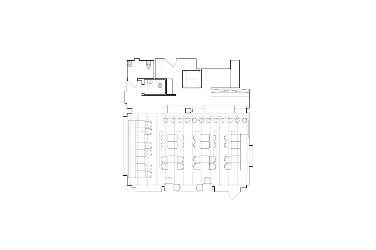
Plotas: 104,46 m²
Gaisrinė
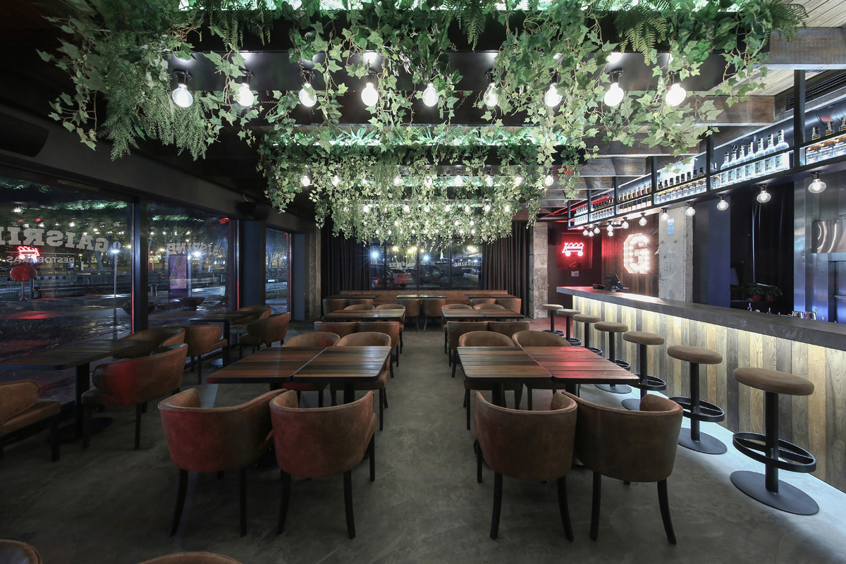
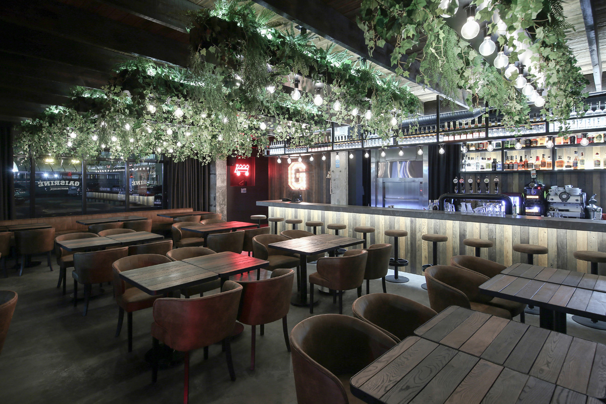
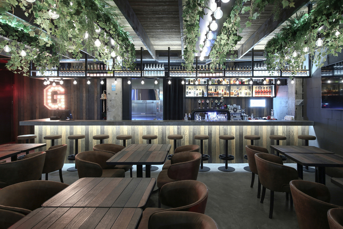
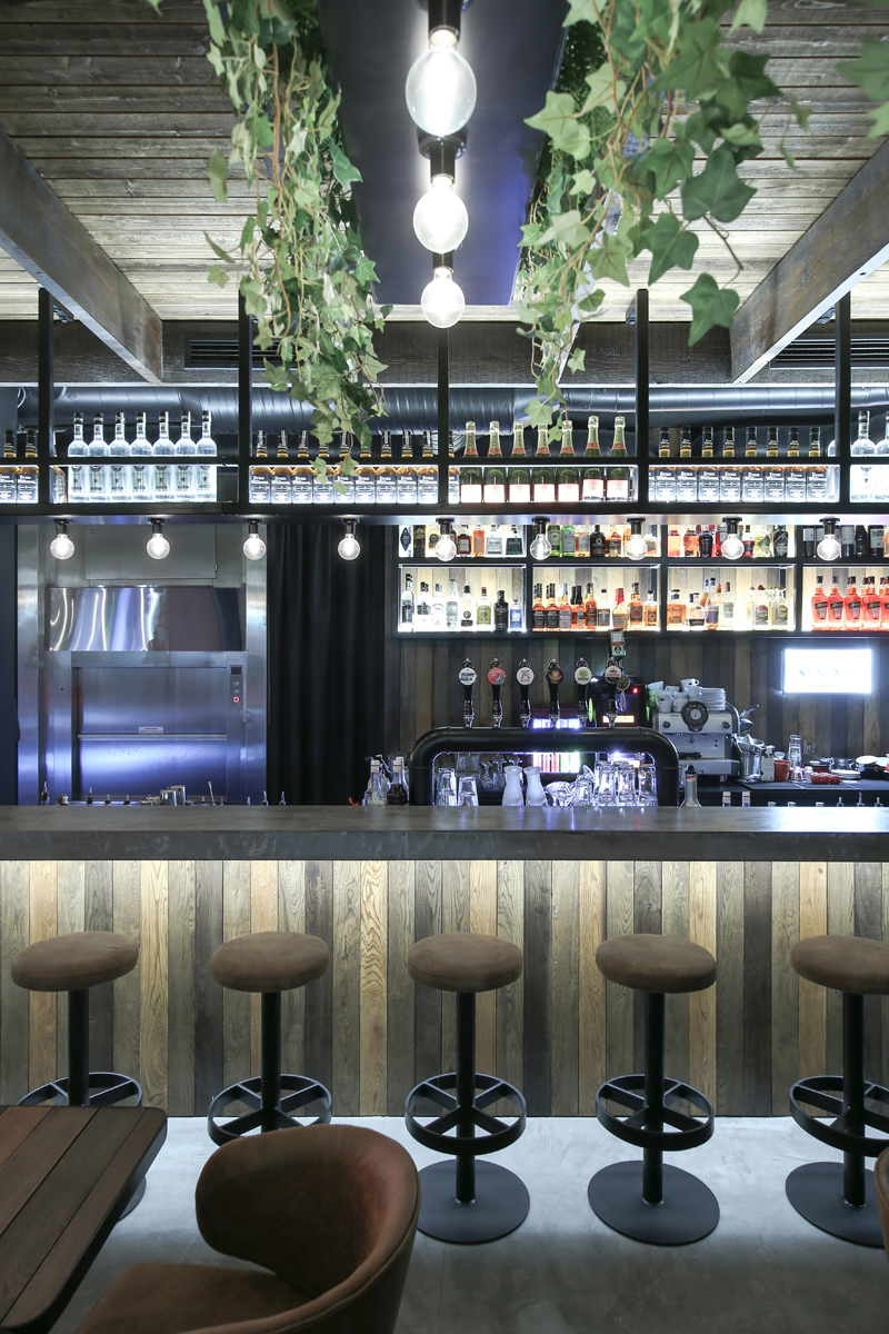
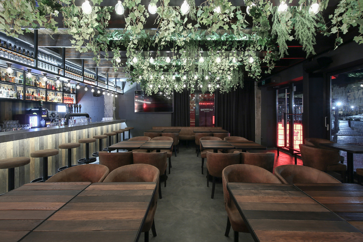
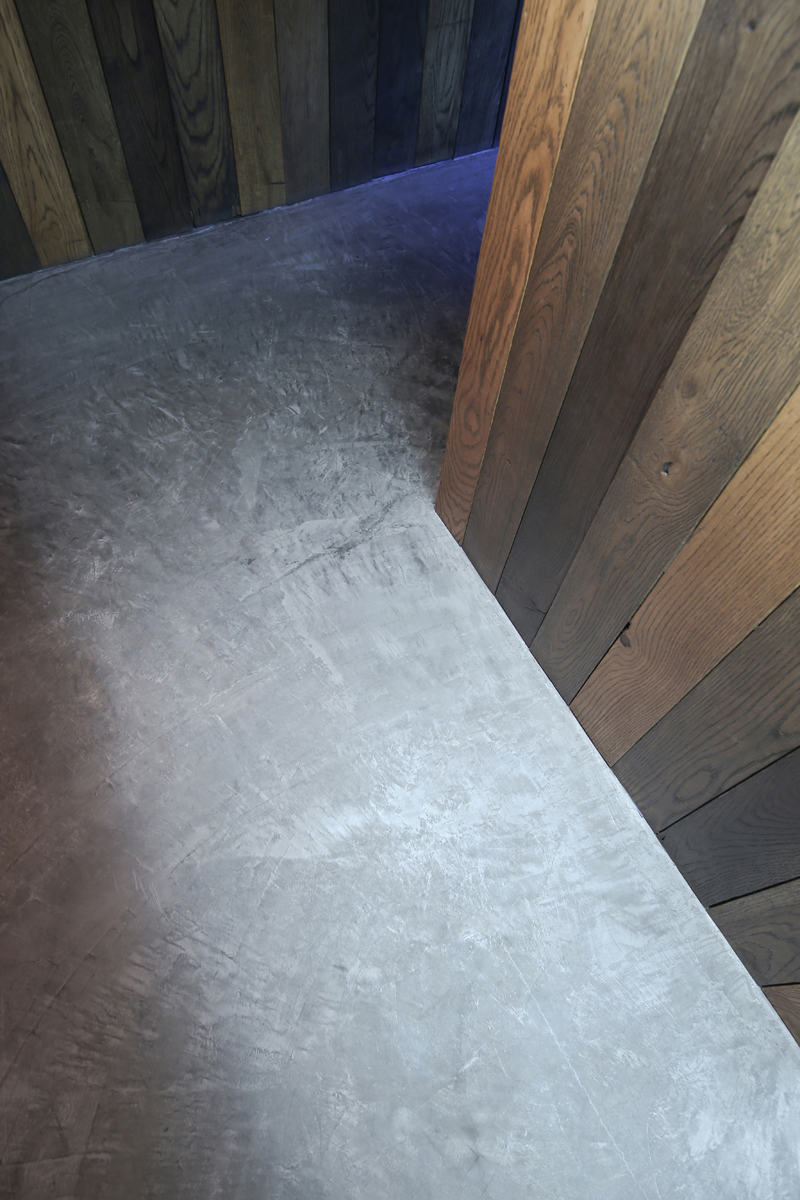
Restobaras „Gaisrinė“ įsikūrė patalpose, kuriose prieš tai vykdė veiklą jau keli restoranai, tad kartu su užsakovais buvo nuspręsta išsaugoti tam tikras interjero detales. Tai medinių lentelių lubų apdaila ir jau įrengti sanmazgai. Nauji sprendimai sukurti vadovaujantis mėsos rūkyklos tipo restoranų (angl. “smokehouse restaurant”) interjerams būdinga grubia stilistika (angl. “raw style”). Jai būdingi sendinti, šiurkštūs ir natūralūs paviršiai, juodi ir pilki atspalviai bei betonas. Sekant šia idėja, interjere panaudotos skirtingų spalvų tekstūruotos ažuolo lentos, grindų ir baro stalviršio, tarsi seno ir pajuodusio, betono padengimas, oranžinio atspalvio odos kėdės ir minkštasuoliai, bei juoda spalva dažytos metalo konstrukcijos ir pilkos sienos. Gaivumo gan tamsiai erdvei suteikia ant lubų pakabinti loviai su gausia kambarinių augalų žaluma, ir tarsi girliandos, ritmiškai ant metalo konstrukcijų išdėstytos vintažinės lemputės. Pats pavadinimas „Gaisrinė“ atsirado jau interjero formavimo procesams įsibėgėjus, tad nutarta vardo tiesiogiai nebesieti su interjeru. Pavadinimo sąsajos išlaikomos meniu ir socialinėje komunikacijoje. Vienintelė interjero sąsaja su pavadinimu – specialiai suprojektuota raudona G raidės iškaba.
English:
The Restobar “Gaisrinė” is located in the premises where several restaurants had been operating before, so together with the customers it was decided to preserve certain interior details. That is a wood plank ceiling finish and already installed bathrooms. The new interior solutions are based on the raw style which is characteristic for smokehouse type restaurants. It is characterized by aged, rough and natural surfaces, black and grey shades, and concrete. Following this idea, textured oak boards of different colours, old-like and blackened concrete covering of floor and bar countertop, orange leather chairs and sofas, as well as black painted metal structures and grey walls have been used for the interior. Troughs with abundant houseplant greenery and, garland-like, vintage bulbs arranged rhythmically on metal structures give the freshness to the rather dark space. The name “Gaisrinė” (fire station) itself appeared already after the acceleration of interior design processes, so it has been decided not to link the name directly to the interior. Name interfaces are maintained in a menu and social communication. The only interior interface with the name is a specially designed sign – red letter “G”.