
Apie projektą:
Bendraautorė: Liucija Kuchalskytė
Šalis: Lietuva
Plotas: 40 m2
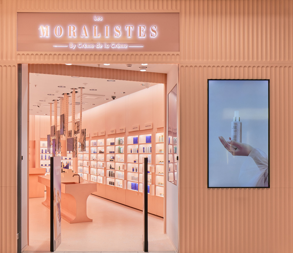
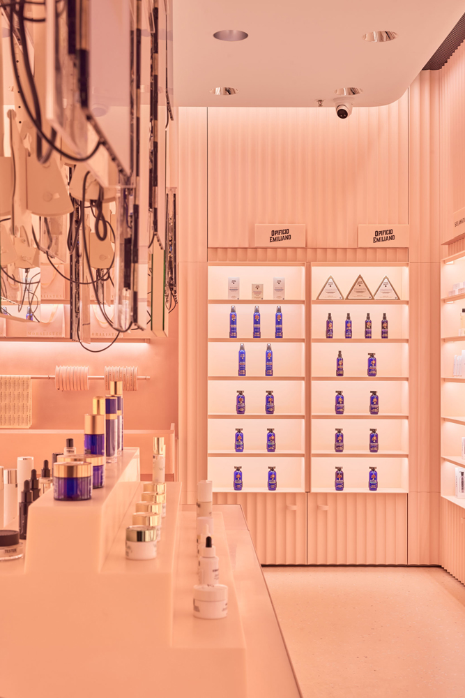
LES MORALISTES. Odos priežūros kosmetikos parduotuvė
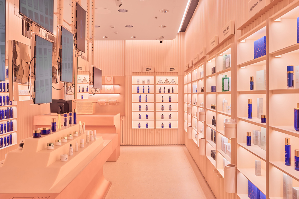
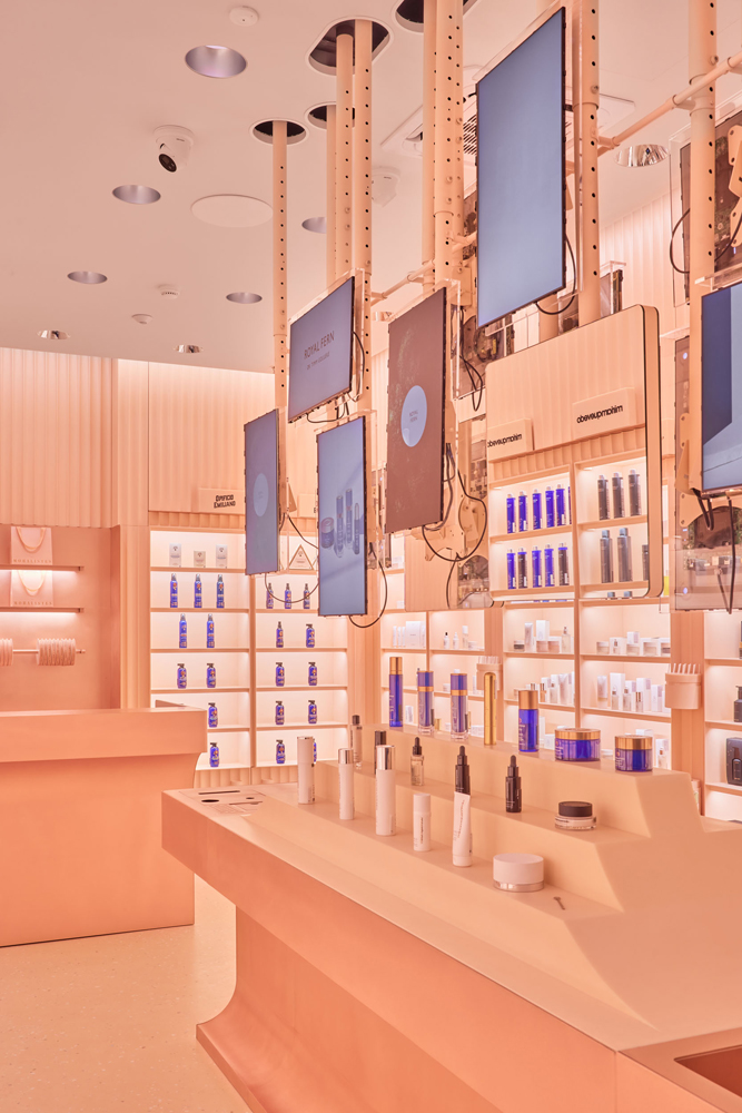
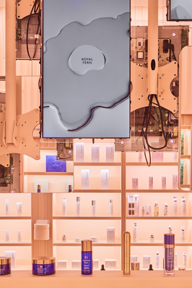
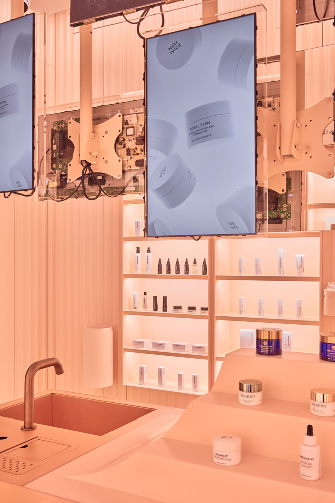
Šis interjeras yra kaip persiko odelė, bet išvertus paaiškėja – kad dirbtinis, kad viskas yra technologija. Pagrindinė erdvės idėja yra klasikinio orderio interpretacija ir futuristinių technokratinių elementų tarpusavio perpynimas. Čia lengvai ironizuojama (moralizuojama) tapatybės suvokimo per socialinių tinklų filtrą ir grožio sąvoka nūdienos kontekste. Iš čia parduotuvės centre atsirado kabantys monitoriai su praregimom mikroschemom ir atvirom laidų gijom. Tarpe jų įkomponuoti veidrodžiai. Tai interaktyvumo momentas, galimybė pamatyti save per reklamos filtrą.
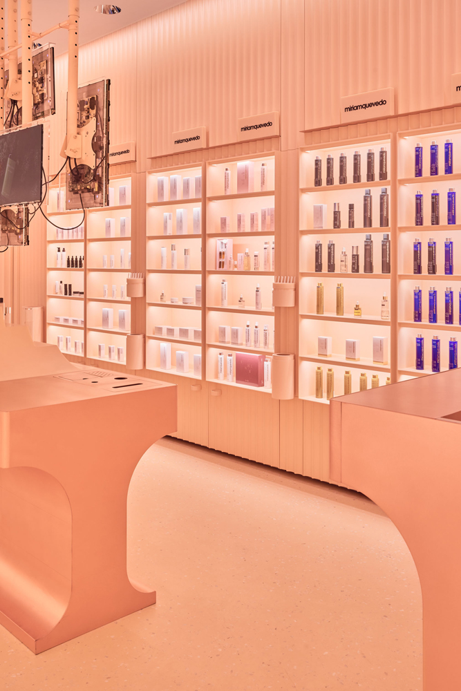
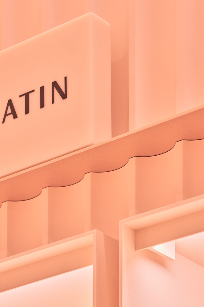
Interjeras yra vienos spalvos tik skirtingų medžiagų ir faktūrų. Spalva iš pažiūros stereotipiškai rožinė, tačiau turi aiškų poslinkį gelsvos gamos link. Tai yra sąmoningas veiksmas. Moterišką pradą dauguma identifikuoja būtent per rožinę spalvą, tačiau tonalinis poslinkis šiai spalvai suteikia kitą, platesnę prasmę. Ji tampa abstraktesnė, gaubianti, ribiniai minkšta, terapinė. Centrinėje saloje esantis ekspozicinis elementas savo medžiagiškumu referuoja į muilą. Taigi – į švarą. Ta pati medžiaga panaudota ir logotipų sistemai. Jie tarsi muilo luitai stovintys ant lentynų. Varis interjere tai taurumo ilgaamžiškumo pojūtis.
Šis interjeras tai malonios apgavystės jausmas. Amžinos jaunystės pažadas.
LES MORALISTES. Skin care cosmetics store
This interior is like a peach skin, but when translated it turns out to be man-made, prompting that everything is just technology. The main idea of space is an interpretation of the classic order and the interlacing of futuristic technocratic elements. It is slightly ironical towards the perception of identity through the social media filter and the concept of beauty in today's context. It explains why hanging monitors with transparent chips and visible wire strands appear in the centre of the store. Mirrors make an integral part of the overall arrangement. It is a moment of interactivity, an opportunity to see yourself through an ad filter.
The interior is one colour though featuring different materials and textures. The colour appears stereotypically pink, though showing a clear shift toward a yellowish gamut. This is a deliberate action. The feminine spirit is identified by most people precisely through the pink colour, but the tonal shift gives it a different, broader meaning. It becomes more abstract, enveloping, marginally soft, therapeutic. The exposition element in the central area refers to soap in its materiality. That is to cleanliness. The same material is used for the logo system. They are like bars of soap standing on shelves. Copper in the interior adds a sense of noble longevity.
This interior gives a sense of pleasant deception. A promise of eternal youth.